Updating the Business Intelligence Interface
Over the course of a one year period our UX team overhauled the Business Intelligence interface of our ERP offering in order to bring the functionality into a new era of adoption by cleaning up the pre-existing confusing interface.
Working for a software company that provides an ERP platform, one of the main goals is to help our clients manage their business processes. One of the critical modules of this ERP system is the Business Intelligence (BI) module that provides insights into their company's performance through data visualization and analytics. However, our clients were experiencing challenges with the module's usability, and the user experience was built more for highly technical users. This was leading to low adoption rates, low user engagement, and decreased productivity.
Objectives
The primary objective of the project was to improve the user experience of the BI module of the ERP platform. Specifically, we aimed to simplify navigation and captions and expand data visualization to increase user engagement and drive functionality with simplicity at the forefront


Methodology
We adopted a user-centered design approach to the project, which involved gathering user feedback through research of historical customer requests, interviews with our Professional Services Team (who interacts with our Clients on a daily basis) and a deep investigation into offerings and functionality of other Business Intelligence Platforms. We started by conducting interviews with a few key Product Specialists who have excelled in implementing the existing BI Module, as well as several who worked with clients that had a need for data visualization but were discouraged by the complexity of our solution. The interviews provided valuable insights into the challenges faced by the users and the desired features for the module.
Based on the feedback gathered, we created wireframes and prototypes for the redesigned BI module. We tested the wireframes and prototypes through usability testing sessions with a sample of stakeholders and specialists. The usability testing sessions provided us with valuable insights into the effectiveness of our design and identified areas that needed further improvement.
Results
We were able to improve the user experience of the BI module significantly. We simplified the navigation and captions, making it easier for users to find what they were looking for quickly. Previously, positioning of a BI element on the canvas required defining the position of each edge of the element relative to that corresponding edge of the canvas as a percentage of the size of the canvas. Historically, this was seen as extremely confusing and required quite a bit of offline math to maintain on more intricate BI canvases. We updated this methodology to a more simple 'Size and Position' approach. This entailed creating a defined Anchor Point on each element and allow the user to define its position vertically and horizontally and provide inputs to define the element's width and height.
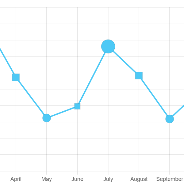
We also expanded data visualization, which made it easier for users to interpret the data and draw insights from it. This included adding Stacked Charts, Radar and Polar plots, Bubble Charts, expanding pies Charts to have Doughnut Charts available, allowing Line Charts to be overlaid on other chart types, allowing the inversion of axis to present a horizontal chart, and replacing the limited Meter chart with a more versatile Bullet Chart.
The improvements would lead to increased ease of user engagement, adoption, and productivity. Product Specialists reported that the redesigned module was easier to use and provided them with the necessary improvements to have confidence in presenting this module to end users. Overall, there was a general feeling that the client's management team would be pleased with the improved user experience and increase in adoption of the BI module was seen as almost guaranteed


Conclusions
Through a user-centered design approach, we were able to improve the user experience of the BI module within the ERP platform. The simplified navigation and captions and expanded data visualization led to increased user engagement, adoption, and productivity. The project was a success, and the client was pleased with the results. We recommend that the client continues to gather user feedback and make improvements to the module as needed to ensure that it continues to meet the needs of the users.